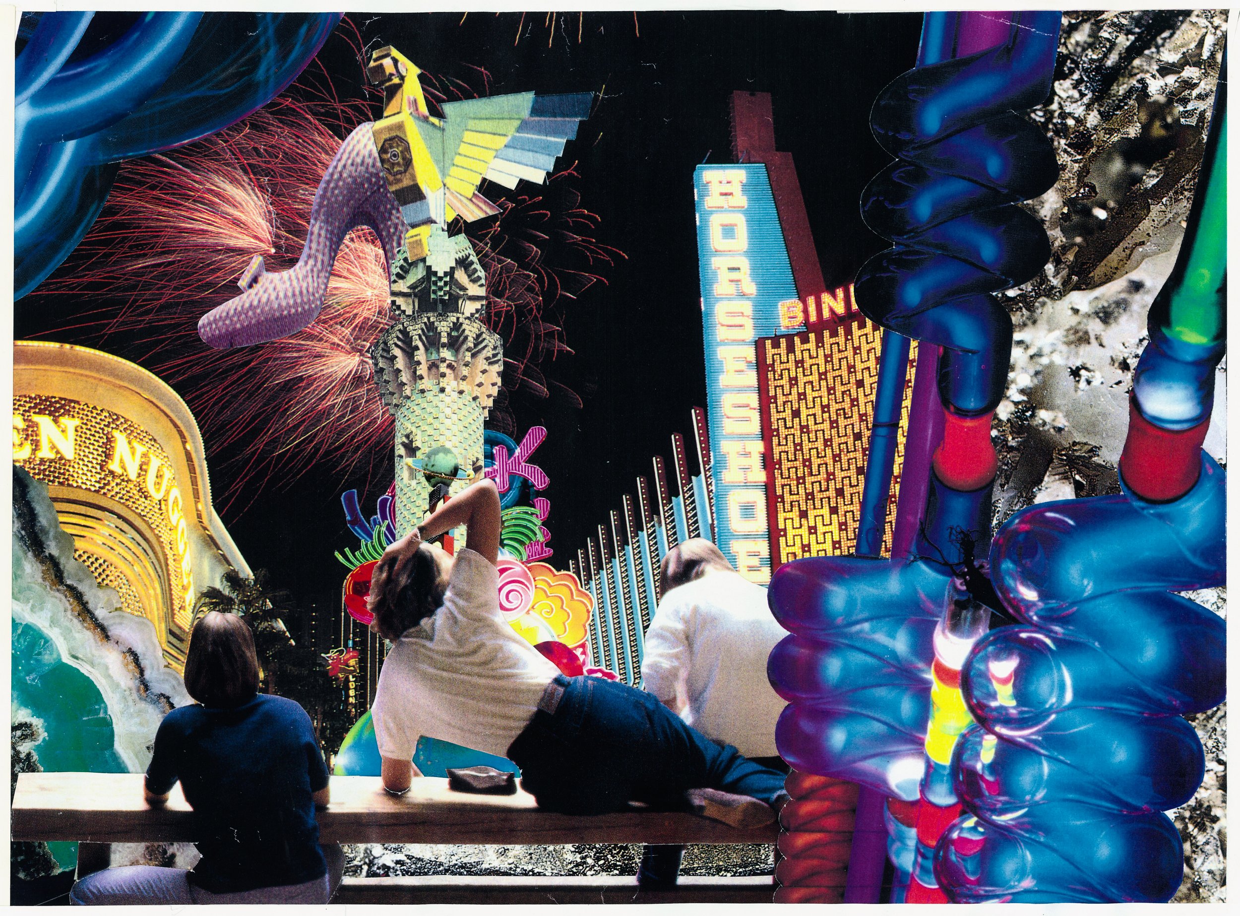
Collage about Las Vegas
At its origin Las Vegas had a tremendous challenge to identify itself to people who knew nothing about a city that, for most purposes, did not exist until the present. Vegas publicists made heroic efforts to invent excuses to place the Las Vegas name in photos that might run as cheesecake gags in newspapers from coast to coast.
The only other available mass media tool to publicize Vegas was postcards. There was no expectation that they should be technically accurate. Postcard producers spent a lot of time in photo labs adding pizazz to their work. I felt like my adding new technology to the process was a measure of respect for the tradition.
Fission Convention
1989
Wilbur’s Cactus
1989
Crossroads
1990
Everyone Wears a Hat
1991
Touchdown
1991
Three Adjacent Las Vegas Resorts
1991
Neon Museum
1992
Aqueduct
1993
Tourist Zone
1994
Flamin' Last Front
1995
Curlique
1998
We are accustomed to the heart of a place being a tangible thing such as a building or a public square. It may be that the architectural heart of Vegas is in the intersections between its tangible elements, in the steps between its enveloping environments. When we create a narrative in these points of transition, as we do, it is there where Vegas’ unique identity is most clear. It is in its intersections.
— Anthony Bondi
Cold Comfort
1998
There are no Italians named Wilbur
1998
Thunderbird
2004
Yellow Foil
2004
Green Dragon
2004
Valle Mote
2004
The Jitters
2004
Primm Valley Neon Museum 2,
2004
Primm Valley Neon Museum 1
2004

Seeing the strip as a jumbled collage itself, Bondi became an incidental seer, particularly with that early-90s piece placing the Stardust sign in Venice (long before the Venetian arrived on the Strip). At the time, the fan of postcards (a "native art form" here) was toying with Vegas as a sort of Venice in its "heyday," when the Orient and Occidental met, creating a mix of the world's architecture…
-Kristen Peterson in Las Vegas Weekly 2013


